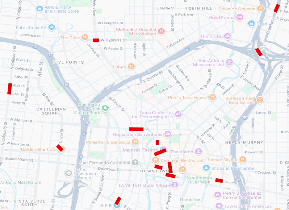
This project began with several years of crash data from the Texas Crash Resource Information System (CRIS), filtered and processed to derive a dataframe of crashes in the San Antonio metro region in which one or more pedestrians was involved.
Once that initial inquiry was made and the data processed, I wanted to use it to identify corridors with higher numbers of incidents involving pedestrians and cars. That effort is described here.
I used some code to take the pedestrian crash points and highlight the corridor segments. Instead of drawing an arbitrary hexagon grid to find crash clusters, I used the data points themselves to indicate the linear pattern from which we can identify problem corridors where multiple pedestrians are hurt over time. That looks like these:

To do this, I used the processed data I mapped initially. That data contains crashes without any coordinates or geography. Those had to be removed before the code would run. So Caveat #1: this analysis only includes crashes for which a location was provided in the crash data.
Once removed, each crash point is converted into a pair of coordinates using a projected coordinate system (so distances are in meters, not degrees, which is what lat/lon are).
We then run a clustering algorithm called DBSCAN, which stands for Density-Based Spatial Clustering of Applications with Noise.
# eps: max distance (in CRS units, here meters) for points to be considered neighbors
# min_samples: minimum number of points to form a dense region (cluster)
eps = 75        # this is the maximum distance between points to be considered neighbors, it's short for epsilon; begin with a range inside 50–150 meters; adjust based on results
min_samples = 10  # minimum crashes to treat as a corridor seed; might need to reduce slightly.

# Run DBSCAN
db = DBSCAN(eps=eps, min_samples=min_samples)
labels = db.fit_predict(coords)

# Attach labels to GeoDataFrame
ped_fatal_crashes_all["cluster_id"] = labels

# Quick sanity check: how many clusters did we get (excluding noise = -1)?
cluster_counts = ped_fatal_crashes_all[ped_fatal_crashes_all["cluster_id"] != -1]["cluster_id"].value_counts()
cluster_counts.head(), cluster_counts.shape[0]
The algorith looks for places where points are close together and ignores the others as noise.
In this case, we explicitly told DBSCAN that crashes have to be within 75 meters of each other (eps = 75) and that at least 10 crash points must be present (min_samples = 10) to count as a cluster.
These settings are arbitrary, chosen by me to see what kind of hot spots jumped out. If they serve the purpose we need, we’ll keep them. If not, they can be easily modified and rerun to produce a different result — either greater or fewer corridor hotspots.
For each cluster that DBSCAN finds, we then use a statistical tool called PCA (Principal Component Analysis) to figure out the main direction in which those crashes line up.
You can think of PCA as asking: “If I had to connect these points with a line, what direction would it point?”
# Apply PCA to each cluster to find its dominant axis
## Storage for PCA results
pca_results = {}

# Get unique cluster IDs except noise (-1)
cluster_ids = sorted([cid for cid in ped_fatal_crashes_all["cluster_id"].unique() if cid != -1])

for cid in cluster_ids:
    # Extract points in this cluster
    cluster_points = ped_fatal_crashes_all[ped_fatal_crashes_all["cluster_id"] == cid][["x", "y"]].values

    # Apply PCA
    pca = PCA(n_components=2)
    pca.fit(cluster_points)

    # Mean (center of cluster)
    center = pca.mean_

    # First principal component (dominant direction vector)
    direction = pca.components_[0]

    # Store results
    pca_results[cid] = {
        "center": center,
        "direction": direction,
        "points": cluster_points
    }

# Quick check — show the first few PCA results
list(pca_results.items())[:3]
The result PCA produces gives us a center and a direction vector for each cluster. We then project every crash in that cluster onto that direction, find how far they extend at each end, and use the extreme points to draw a single line segment through the cluster.
The end result is a new layer made of line features, each representing a corridor with a statistically significant grouping of pedestrian crashes.
Each line has attributes like the cluster ID and the number of crashes that contributed to it. When this polyline layer is loaded into mapping software like QGIS and laid atop the original crash points, the highest-density, street-shaped problem areas become visible at a glance.
The caveats are straightforward but important:
- crashes without valid geometry never appear in any corridor; and
- the patterns you see are conditional based on the chosen parameters of 75 meters for neighborhood radius and a minimum of 10 points per corridor.